Ophel gives you full control over how the panel looks.Documentation Index
Fetch the complete documentation index at: https://urzeye.mintlify.app/llms.txt
Use this file to discover all available pages before exploring further.
Light, dark, and system mode
Ophel supports three color modes:- Light — always use a light theme
- Dark — always use a dark theme
- System — automatically match your operating system preference
- Keyboard shortcut
- Settings
Press
Alt+D (Mac: Option+D) to cycle between light and dark mode.Sync native page colors
When this option is enabled, Ophel also adjusts some native element colors on the AI platform page to match the current light or dark mode — for example, input fields and scrollbars that the platform exposes as themeable. This works only on supported sites. Setting: Settings → Appearance → Sync Native Page Colors (enabled by default)The site’s light/dark mode always follows Ophel’s active mode. This setting
controls only the additional adjustment of native element colors on the page —
disable it if you notice visual conflicts on a particular site.
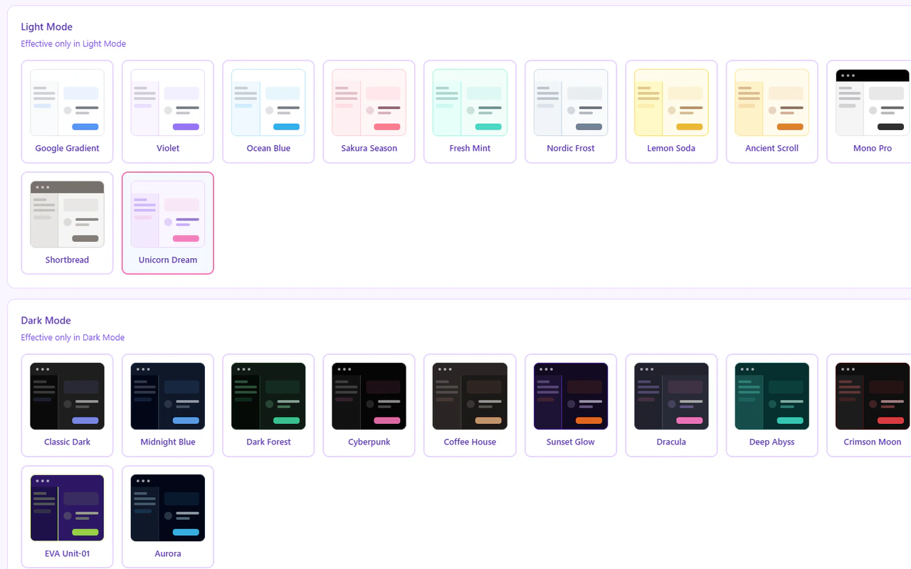
Built-in theme presets
Each mode comes with 12 presets. Click any preset card in Settings → Appearance to preview and apply it — the transition uses a radial animation that expands from the point you clicked.- Light presets
- Dark presets
| Name | Description |
|---|---|
| Google Gradient (default) | Clean white with a blue-green gradient header |
| Violet | Soft purple accent palette |
| Ocean Blue | Calm sea-blue tones |
| Sakura | Delicate pink blossom palette |
| Mint | Fresh mint-green highlights |
| Nordic Frost | Cool Nordic minimalism |
| Lemon Soda | Cheerful yellow-citrus palette |
| Ancient Scroll | Warm parchment and sepia tones |
| Mono Pro | Minimal black-and-white typography |
| Blue-and-White Porcelain | Classic Chinese porcelain blue |
| Shortbread | Warm cream and biscuit tones |
| Unicorn Dream | Pastel gradient dream theme |
Choosing a theme
- Open Settings (
Alt+,, Mac:Option+,) - Go to Appearance
- Select Light or Dark from the mode tabs
- Click any preset card to preview and apply it
Custom CSS
For complete control over the panel’s appearance, go to Settings → Appearance → Custom CSS and write your own CSS rules. The panel runs inside a Shadow DOM, which means your custom CSS is isolated from the AI platform’s page styles — your rules only affect the Ophel panel, nothing else on the page. The panel’s built-in styles use CSS variables prefixed with--gh-. Override any of them inside a :host block:
Changes to custom CSS apply instantly. You do not need to reload the page or
restart the extension.
Key CSS variables
| Variable | Controls |
|---|---|
--gh-bg | Main panel background |
--gh-bg-secondary | Secondary background (sidebars, alternating rows) |
--gh-text | Primary text color |
--gh-text-secondary | Muted text color |
--gh-primary | Accent / active color (buttons, highlights) |
--gh-border | Border color |
--gh-shadow | Panel drop shadow |
--gh-header-bg | Panel header background (supports gradients) |
--gh-danger | Delete / destructive action color |
--gh-hover | Row hover background |